F1 75 Live: What went down & livery ratings
 • 19 Feb 2025
Features
• 19 Feb 2025
Features
Cool event, but let’s not do it every year…
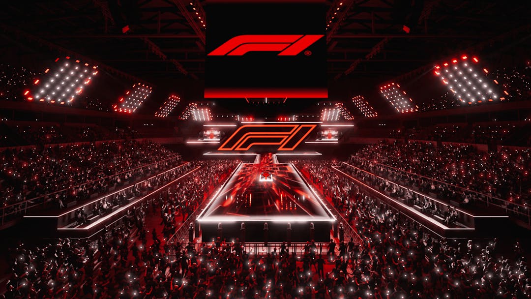
The 2025 Formula 1 season feels like it’s officially here with the highly anticipated F1 75 Live, the most unique showcase that F1 has ever put on.
Live from the London O2 Arena, all 10 teams and 20 drivers were in attendance to reveal how their 2025 challengers will look for the first time (or at least for the first time for most).
It was an event like no other, especially for Formula 1, and it certainly has built more excitement for the start of what is tipped to be one of the most tightly contested seasons in F1 history.
So with the event now over and the cars officially released (the paint job, at least), we can take a look back at the historic occasion and rate each team’s liveries for the year.
F1 75 Live: What went down
F1 75 Live was a one-of-a-kind event. F1 has never done anything this extravagant before, hence why we’re a bit at odds about it.
It’s a cool idea, having all the teams show off their liveries for the year in one big showcase, but it definitely was for a specific audience, which in our opinion was the American audience that F1 so dearly loves and continues to build into.
Despite being held in England, the show featured American music artists mainly, with Machine Gun Kelly kicking things off followed by country singer Kane Brown.
Our very own Take That did end the show, but all the theatrics, music, lighting, the general big show and vibe of the event felt super theatrical.
The show ran for two hours, with each team being given roughly five minutes to do a little presentation and show their car, the drivers in the new race suits and the team principle.
Some kept it simple, doing a little video then going straight into the reveal. Others made a real meal of it. Unsurprisingly, Red Bull did the most with theirs. In typical Red Bull fashion, they had a full marketing campaign similar to the Coca Cola truck Christmas ads.
Their video went on for so long that they didn’t even have time to speak to drivers Max Verstappen or Liam Lawson after they came out.
Alpine’s has also been widely panned, with a DJ set that went on for far too long before the reveal. Despite how loud everything was and the seizure-inducing light show throughout, this DJ still found a way to be panned, possibly the most out of everything by fans online.
As far as car reveals go, we’ll be glad to never see this again. But as a one-off to mark the celebration of F1’s 75th anniversary, something which they will no doubt continue to celebrate at various points throughout the season, it was perfectly fine.
Livery ratings
I’m going to put my tin foil hat on for a moment because I believe that the rule change introduced for this year, which increased the drivers’ minimum weight, was not enforced just for the drivers but to allow the teams a bit more weight so that we didn’t get as many boring, samey carbon fibre designs that we had last year.
Sure, there are still a few teams that have done it again this year. But there are also more who have gone bold. The grid feels colourful once again, and we’re here for it.
Let’s take a look at each team’s design for the year, starting from our least favourite down to the most. See if you agree with our ranking.
Red Bull
Other than Verstappen having to be there as the reigning champion, what was the point of Red Bull showing up? We all knew they weren’t going to come with a new design, they haven’t changed it basically since they arrived on the grid.
Don’t get it wrong, it’s not like it's a bad looking livery. It has become a staple on the modern grid now. But for the fact that the RB21 looks no different to the RB20, or the RB19, or the RB18 (and so on), we can’t give it that high a rating. It’s mediocre at best.
Rating: 3/10
McLaren
Genuinely can’t tell the difference between this year’s and last year’s car. I suppose they did mention that they weren’t changing much, but they could’ve done something different. It looks identical.
Again though, like with Red Bull, it’s not a bad design and we certainly don’t blame them for keeping it. Plus, with McLaren, they really shine when it comes to the one-off special liveries they do during certain race weekends, like at Monaco.
But, just like with Red Bull, since the design hasn’t changed much, it can’t get a high rating. We expected more from the defending world champions.
Rating: 3/10
Williams
Possibly the only good thing that can be said about Williams' livery is how cool it looks going from the lighter blue at the back fading into the darker blue front wing and nose.
But even that can’t really save it. It’s not a great looking car, especially when you consider the cool white suits that drivers Alex Albon and newcomer Carlos Sainz will be wearing.
They’ll stick out like a sore thumb in the dark car. I was really hoping they would have a lighter design after seeing the race suits, so I’m very disappointed in my favourite team with this effort.
Rating: 4/10
Ferrari
From one disappointment to another, Ferrari really have done my guy Lewis dirty with this.
His first outing as a Ferrari driver and he will be piloting such an uninspired looking Ferrari. The white rear wing is an eyesore, as is the slash of white towards the back and plethora of HP logos darted about the car.
I’m also not mad on the deeper, richer red they’ve opted for. It is, in my opinion, the worst looking Ferrari they have ever put out.
Rating: 4.5/10
Mercedes
It’s a jump in ratings to the remaining six cars starting with Mercedes, who obviously keep the silver theme.
The black darker rear blending into the black is a nice touch, as are the silver stars (not stars but I can’t think of what to call them) within the black rear. The lighter silver on the nose with the bluey-greeney accents along the side visually appealing, too.
Also, I’m taking off 0.5 from their rating because of the comical mess up when bringing out the car, as they had a pit crew around it to change the tyres, only the front right team didn’t get it off smoothly and ended up with a slightly delayed stop. They’ll be hoping that that’s not a bad omen for their season to come…
Rating: 6.5/10
Alpine
Many fans online have heralded the Alpine as the best looking car. I wasn’t instantly sold, but it definitely is warming to me.
I’ve loved the pink variations of their cars in recent years, more so than the blue or black ones. But the way they’ve incorporated the three together this year just hasn’t captured me yet.
I think it’s something to do with the pink BWT on the sidepods. I don’t think it works that well. But other than that, it is a good looking car.
Rating: 7.5/10
Aston Martin
Aston Martin will likely come with a very different design next year when they officially begin their new engine partnership and become Aston Martin Honda, but before then we’ll have to put up with a very same-y design as the last few years.
There are very noticeable differences, though, and they work very nicely. The British racing green is lovely, I like the splash of white on the air box, and the encroaching exposed carbon fibre spreading from the underfloor upwards and along the sidepods works really nicely.
I like the all black front wing, not so massive on the colourful rear wing that stands out against the rest of the car, but overall this is one of my favourites this year.
Bonus points for the James Bond-esque entrance with a wondrous performance from Tems.
Rating: 8.5/10
Haas
I haven’t seen many people giving this car much love, so even if I am in the minority, I’m happy to be there.
I love the look of this year's Haas. They remain with the white, red and black that they have become synonymous with over their 10 years since joining the grid, and I’ve got to say that this is my favourite mix yet.
There’s a lot more white compared to last year’s car, with it spreading to the sidepods now to make the big ‘Haas’ written along the side black against the white, which looks fantastic to me.
It has a very Toyota Gazoo Racing vibe to it, and there is absolutely nothing wrong with that, but is also no surprise given that they are the official technical partner to the team. Here’s to hoping that it becomes more than just a logo on the car…
Rating: 8.5/10
Kick Sauber
Hate the name, love the car.
Sauber’s final year in F1 (or at least the team name Sauber) will likely not be remembered for what they achieve on track this season, but certainly should stay in people's minds for years to come thanks to their potent green livery.
The black rear feeding into the green front is wonderfully done to me. The white Stake logos keeping mainly to the black areas of the car is a good touch as they don’t stand out as much on the green.
Some have said there’s a bit too much going on with the front end of the car but I don’t agree one bit. I like it a lot, enough to go second in my rankings.
Rating: 9/10
Racing Bulls
The Red Bull junior team have once again changed their name, but have also given themselves yet another fresh new look - and it is a tasty one, if I may be so bold.
Officially known as Visa Cash App Racing Bulls but no-one will be saying that first part, the team have gone with what I describe as the light version of the Red Bull, sporting a mostly white design which must be said, really works for all the teams who have opted for it.
The senior team’s influence is very much there, with the brazen Red Bull logos on the nose and the air box above the drivers head stickered on in the same fashion as the main team.
I’m not a massive fan of the blue bulls racing from the back and shrinking into the white, but other than that I think this is a stunning car, possibly the best on the grid this year in my opinion. It’s not getting a perfect score, but it’s very close to one.
Rating: 9.5/10
Find a Deal
Enter your postcode now to see the best deals in your area.